Technical Analysis: How to Read Candlestick Charts
February 7, 2022
8 min


In this article, we’ll understand how real trading experts read charts, and in particular how candlestick charts are read according to technical analysis.
What are candlestick charts in technical analysis
You may have seen somewhere these charts consisting of red and green vertical bars. These bars are known by the poetic name of “Japanese Candlesticks“.
The origin story of this type of chart is as exotic as its name. The invention of candlesticks dates back to the 18th century in Japan to predict the price of rice.
Fun fact
The invention of the japanese candlesticks is attributed to Munehisa Homma, a rice merchant who lived between 1724 and 1803 in Sakata.
Candlesticks summarise price movements over a predetermined time frame that can be selected from the exchange interface.
This time frame can be one minute, a few hours, one day.
On the Young Platform app, you have all the market data for each cryptocurrency and you can also set the candlestick display on the price charts by clicking on the icon in the top left corner of the chart.
You can select the period you want to display: day, week, month, 6 months or 1 year.
You can read the prices that make up the chart by tapping and holding anywhere on the candlestick chart.


Anatomy of a Candlestick
Now let’s see how to read candlestick charts: in this way, we will understand why they are so useful in technical analysis and trading.
There are two types of candlesticks:
- Bullish: a (generally) green candle, representing a positive price movement
- Bearish: a (generally) red candle, representing a decrease in price
Each candle represents the price movement in a given period and has several components:
- The Body of the candle, which is the central part in green, represents the price difference between opening and closing.
- The Range is the difference between the high and the low, thus representing the price range represented by the entire candle.
- The Open marks the price at the beginning of the period, and thus represents how the period was “opened”.
- The Close marks the closing price of the period represented by the candle, i.e. the last one recorded.
- The Wicks, i.e. the lines similar to the wicks of the candle.
- The High is the highest end of the upper wick, representing the maximum price reached during the time interval.
- The Low is the lowest end of the lower wick, representing the lowest price reached during the period.
The candlestick charts we will use here are green and red, and the body of the candles is filled with colour.
However, there are different ways of displaying candlestick charts, which traders can choose according to their preferences:
- Bars: here there is no body, but simple bars coinciding with opening and closing prices
- Black and white: this is the original “colour” of the candles, used by Japanese traders.
How to read candlesticks: examples
Let’s take as an example a candlestick that symbolises the price movement of bitcoin in a single day. We will use dummy prices for simplicity.
The entire chart will represent the trend over a number of days.
Let’s assume that during Day 4, represented by a single candle, these changes in the price of bitcoin occurred:
Day 4 for BTC
- Open = $20
- High = $60
- Low = $10
- Close = $50
This is a positive trend or bullish candle, as the final price is higher than at the beginning of the day.
The candle representing this movement will therefore be green and look like this:

Let us now look at an example of a daily downtrend, thus examining a red or bearish candle.
Day 5 for BTC
- Open = $50
- High = $60
- Low = $25
- Close = $30
Since it is the next day, the opening price will coincide with the closing price of the previous day.

These are its key points

Being a negative trend, the candle is red and the open is higher than the close because the day closed negative.
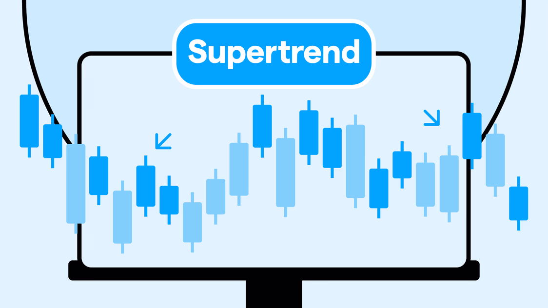
Interpreting candlesticks with technical analysis
Candlesticks are much more detailed representations of the price trend than a classic linear chart and are therefore suitable for advanced technical analysis.
Some traders or analysts help themselves in their psychological analysis of the market by interpreting candles as a series of battles between supply and demand, between sellers and buyers. When the candle closes in red, it is bearish, and therefore the sellers have won.
Watching the price bar move to form a new candle is a bit like watching a tug-of-war contest. When the bell rings, the closing price is recorded and the winner is determined, which will give the candle its colour.
The Japanese have been using this representation for 300 years, and have taken the trouble to name every possible candlestick configuration – as if they were tai chi positions.
Let’s take some very simple examples.
Doji Candles
The Doji is a type of candle that represents a period of time in which the first price and the last price coincide, so the candle has no body, and is made of wicks alone.
The exact opposite would be a candle without wicks, in which low and highs coincide with the opening and closing prices.
Because of this price movement, the candle takes the shape of a cross. Depending on where the opening and closing prices coincide, the Doji takes different names:

In general, doji represent price stagnation, i.e. a moment in which supply and demand balance each other out.
Some interpret these candles as a sign of price reversal, while others see them as a sign of consolidation.
As with any type of candle, it gives more guidance when read in combination with those that precede it.
Engulfing candles
Engulfing candles get their name from the fact that they completely “swallow” the candles that precede them.
A bullish engulfing candle is green and appears after a red candle with a smaller body, thus marking an increase in price.
A bearish engulfing candle, on the other hand, is red and signals renewed pressure from sellers, immediately following a smaller green candle.
Usually, these two configurations indicate a reversal of the price trend.

Patterns and types of candles are numerous, but it is even more important to use other technical analysis tools in conjunction with these.
Related